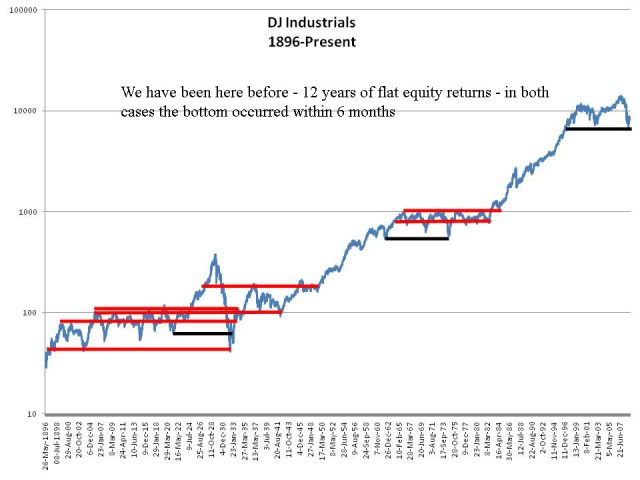
One interesting piece in particular of research crossed my virtual desk recently. A chart was being used as justification to buy stocks under the logic that stocks go up in the long run and they have been flat for 12 years now, ergo it is time to buy! I have reproduced their slide to avoid reusing their name and logo and it looked like this:
 The first black bar represents the period from 1921 to 1932 - twelve years later and the stocks started climbing again. Similarly, the second bar represents the period from 1962 to 1974. Again, you can see from the chart that stocks began to rise again. Obviously the authors of the slide are trying to highlight the same thing from 1997-2009.
Certainly, there is merit to the thinking "stocks have gone nowhere for a long time, therefore the next decade is probably going to look better than the last decade." This thinking is valid and logical based on both historical evidence and reasonable expectations regarding demographics, economic growth and valuations.
So what is wrong with this particular analysis? For starters, it is entirely arbitrary. Take for instance the two historical 12-year periods, 1921-32 and 1962-74. The beginning of each black bar starts on a dip in stock prices. Notice that the starting period of our current period is not a dip, but rather an incredible spike up. How were these beginning periods chosen? They don't say. Take a look at this chart, with me adding a few more periods:
I can find lots of 12-year or longer periods where stocks go nowhere. What about 1899-1933 or 1903-32 or 1905-35 or 1908-1941 or 1925-48 or 1963-1981 or 1965-82. Again, what makes the 12-year line so special? Why not a 20 year line? They failed to provide any logic to such questions. This has been just another example of people drawing lines on charts that mean nothing.
No comments:
Post a Comment